We're all just slaves to the mistress that is physics. Outside of creativity, a photographer is merely a problem solver that understands both the limitations of physics and their available tools to tackle it, which is why a fancy camera will do you no good if you can't use it - so tell that to people the next time they tell you that your fancy camera must be amazing at taking photos - and even then, let's face it, it's probably more the lens and your decision-making; a good camera just aids that process with simplicity and convenience.
Read MoreFreeze Time with Us
Splash Point Photo - where every shot is a story.
About Us
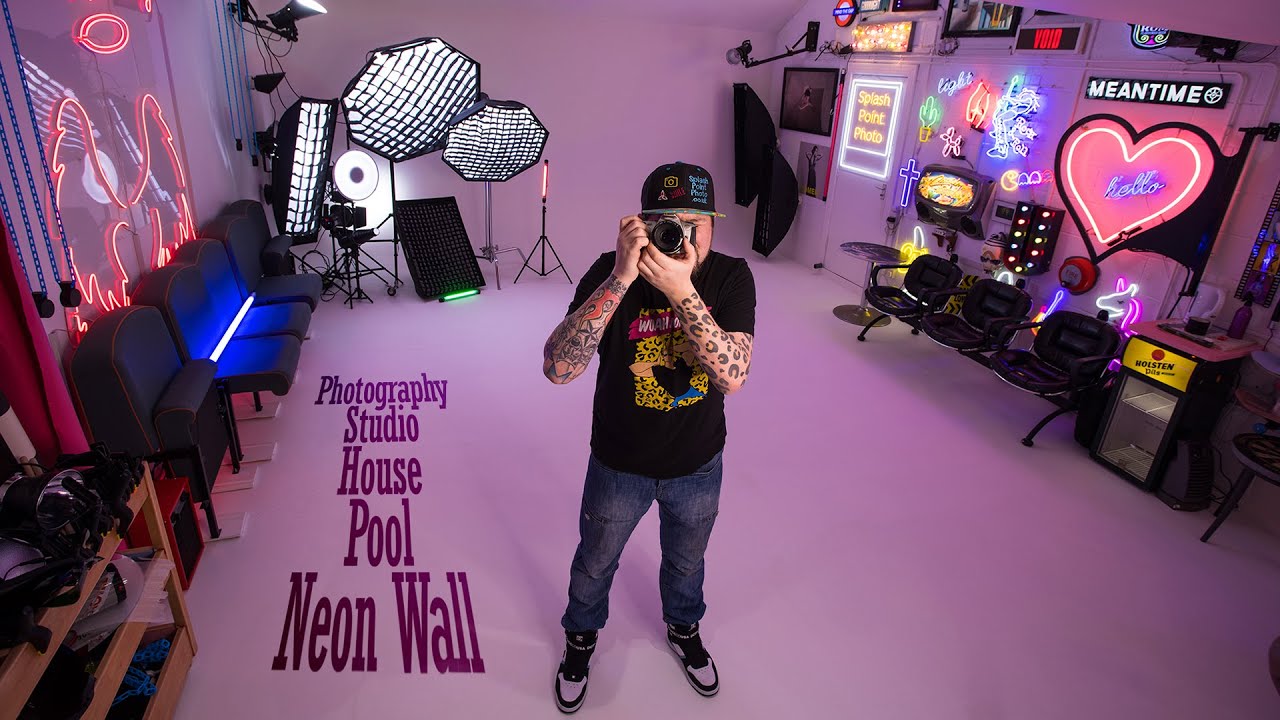
A studio, a pool, a neon wall, and beautiful house decor make our photography studio in North Wales a bespoke and unique space for both professional and hobbyist models & photographers alike. It can be hired for an hourly fee, while photographer owner, Russ, who is an awarded, exhibited and published photographer, is also available for editorial style portrait commissions and model portfolios. While Russ doesn't offer family style photography, we do have photographers who hire us for family images. Check the relevant tabs for more information!
PHOTOGRAPHY LEVELS
Please be aware that we're a creative photography studio, and aren't prudish, so you will encounter nude photography as you click and scroll throughout this site! Russ is often commissioned for life drawing (fully nude) and 3d rendering for animation, and he is also a lover of art and provocative imagery. Along with boudoir being a hugely popular genre of photography, as a studio, we have no problem with lingerie, and we allow art nude, but not 'adult' levels without any artistic merit.
Studio Hire
For just £20ph, you can hire Splash Point Photo Photography Studio! Studio hire includes all our photographic areas and lighting, and that's some major bang for your buck given we're based in North Wales rather than a major city, as that would undoubtedly be twice the price with our kind of facilities.
Studio photography requires you to have a camera with a centre pin hotshoe (or a PC port) to enable you to trigger the strobe lights. While Russ is always on hand, we encourage new photographers to get comfortable in manual mode and research the basics of studio lighting. For instance, when shooting with strobe lights, you must use manual so you don't exceed the maximum shutter speed (1/125th of a second) that syncs with the lighting, and combine it with a fixed ISO & aperture so your camera isn't changing your settings for each shot. While we do have continuous light options for creative set-ups and use on our neon wall, strobe lights offer the most amount of quality because of their sheer output of light. This enables you to push the camera far less hard. Picking a single Autofocus point is also a huge advantage in taking control - remember, in the studio, YOU should be in control as the conditions don't change unless you change them. Don't allow the camera to second guess what it thinks you want, as it simply cannot read manual strobe lighting and will instead try to understand the ambient lighting in the room.
Check out the navbar 'Hire' menu for studio days
Galleries
Testimonials
Book Russ
Contact
- 27 Marine Drive, Rhyl, UK
Please e-mail or use the contact form to enquire or book. Combined with being introverted, there are far too many crazy people who expect access to you 24/7 via the phone, plus I find such conversations go in one ear and out the other. We can better dwell on details by having them written down.
Blog
An introduction to the Bowens Esprit, a workhorse that just keeps on galloping! Having said that, the only Bowens strobe light I've had fail me so far is the Gemini GM250R, which ironically is newer. Digital strobes have more tech to go wrong, and often times, it's tech that isn't needed for every day non-specialist use.
Read MoreI'd taken some of my favourite and best loved photos on these lights, but they had a bit of a reputation within the industry for overheating. I rarely had issues, and I found that if they did, it was typically just one in a batch of three, yet their pay-off for the price was worth it.
Read MoreIn today's 101, I cover the first strobe lights I ever bought! They're small, they're basic, but ultimately they can do what you need them to do. I always say this, but a light is a light is a light, and what you are paying for is consistency, convenience, build quality and of course, adaptability..
Read MoreA quick introduction to studio photography and the intention of my 1 minute 101 videos that I created to stay busy during lockdown and then remade for the YouTube shorts generation.
Read MoreHi from a new look Splash Point Photo site & blog! From the neon streets to the sandy beach, we've got it all.. kinda. If you're new to us, we're a bespoke and unique photography studio space on the coast of North Wales, famed for our neon wall, heated pool, & being a Tardis studio that is over the road from the beach!
Read More